Business Scenario
According to one of the Gartner’s Report* ‘Mobile will take over PC by 2015’; and it is evident and we already know this fact. Today, Smartphones including Tables have become an integral part and parcel of our everyday life. Consumers now spend much more time on core digital media platforms using smart-devices which demands, Responsive Design (formerly called RWD-responsive web design), is a client-side technique supporting multiple layouts in a single Web instance. Its simplicity has resulted in wide adoption, with added HTML5/CSS3 features.
Web sites designed for internal or external consumers including employees, need to be RWD compliant. Most of these internet or internet Websites are designed and developed using Microsoft SharePoint or .NET Technology.
Axisvation‘s RWD solutions for SharePoint Portals & Websites
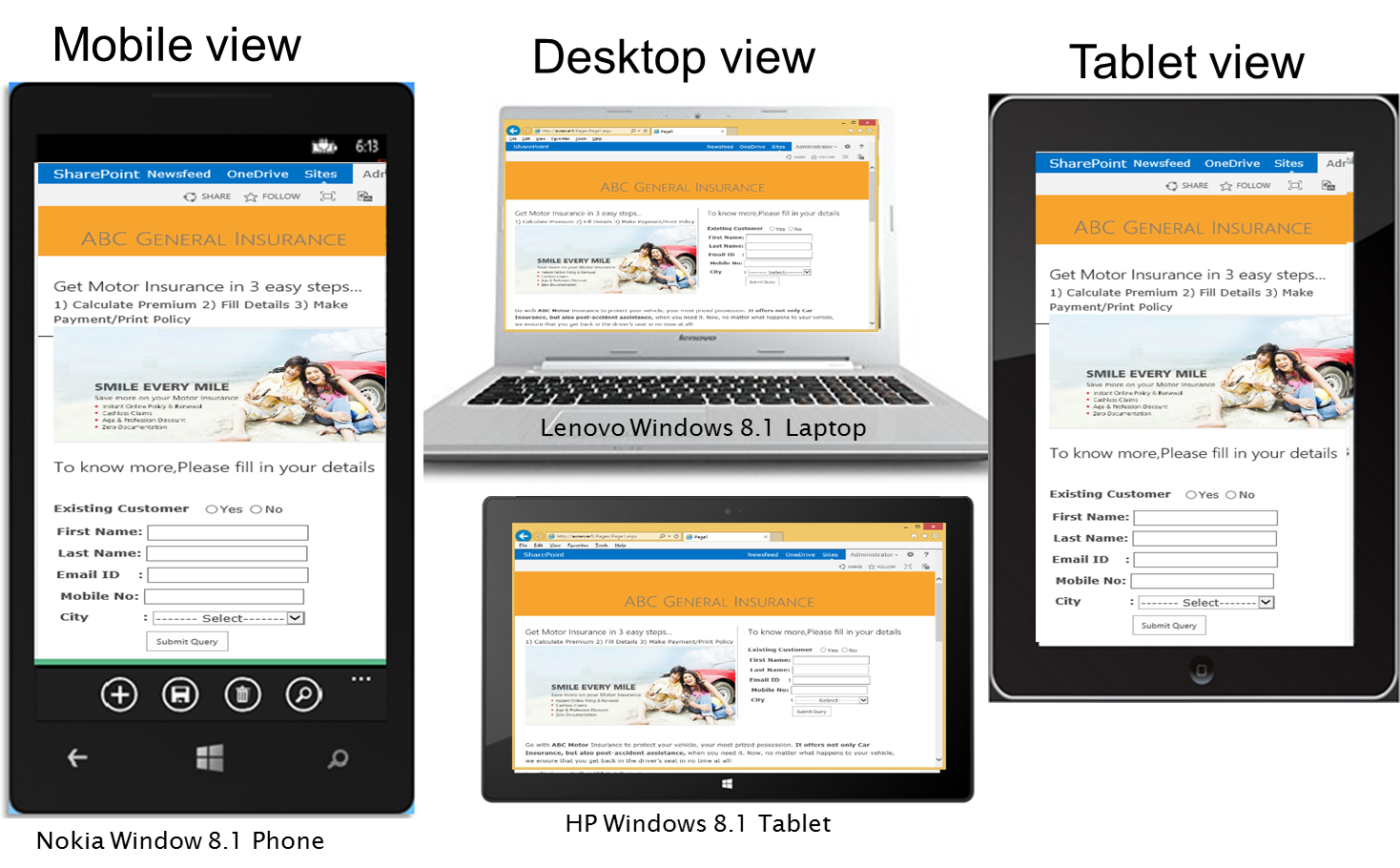
Axisvation’s RWD accelerator is a wizard, allows an enterprise to convert existing intranet, extranet and internet SharePoint sites for Mobile and Smartphone portable.
Reusable and Cost effective - It delivers same content to different devices, maintains same look and feel i.e. one view for multiple devices for quick business turn around, especially for workflows and alerts.
Key Features
- Liquid Flow Design - enables to contract, expand, remove or rearrange with user’s screen size accordingly and become accessible on all internet devices
- Uses CSS3 media queries and fluid grids to create Responsive websites, with optimal layout and design, for screens with various sizes
- Built using Grid Layouts, Reusable GUI components, Bootstrap, JQuery, Function and Wrapped Sets
Benefits
- Setup for Search Engine Optimization (SEO)
- Increase User Experience and Adoption
- Adopt to Multiple browsing Platforms
- Build once for Multiple Devices - Save Cost and time
- Beat the competition

- Improves user web browsing experience since a website adapts to the browser or device compatibility automatically and makes the content look good.
- Access to critical information when you need it
- Easy SEO - There is no need to create specific content for mobile devices, while you still enjoy the benefits of your desktop website SEO on mobile devices
- Low cost. Simple math — one website is cheaper than two
- “One website – multiple devices” concept means that it’s easy to manage and focus on developing good content for your website
- “One website – multiple devices” concept means that it’s easy to manage and focus on developing good content for your website
- Only one set of analytics to examine and a single strategy to develop and deploy
- Responsive websites are easier for consumers to find than traditional or mobile web sites because they come up higher in search engines’ rankings